infini Gin
Infini Gin is a conceptual branding project inspired by my Métis heritage. The goal was to create a gin brand that honors cultural symbolism, storytelling, and the interconnection between people and place. This project merges visual design with ancestral meaning, offering a unique take on how a spirit can carry spirit.
Research
The project began with a deep dive into Métis culture—specifically the iconography and symbolism carried through traditional practices. I focused on the Métis sash and the infinity symbol as core motifs: the sash as a symbol of resilience, movement, and identity; the infinity symbol as a reflection of continuity and interconnectedness.
The idea of land and lineage became a driving theme. I wanted each bottle to speak to the layered experiences and roots of the Métis, blending past, present, and future.

Design
Process
Each flavour corresponds to a chapter of a larger narrative, much like oral storytelling traditions. These were designed to feel nostalgic but unexpected, using botanicals and elements that evoke memory, land, and ceremony. Flavours I picked:
Name & Concept
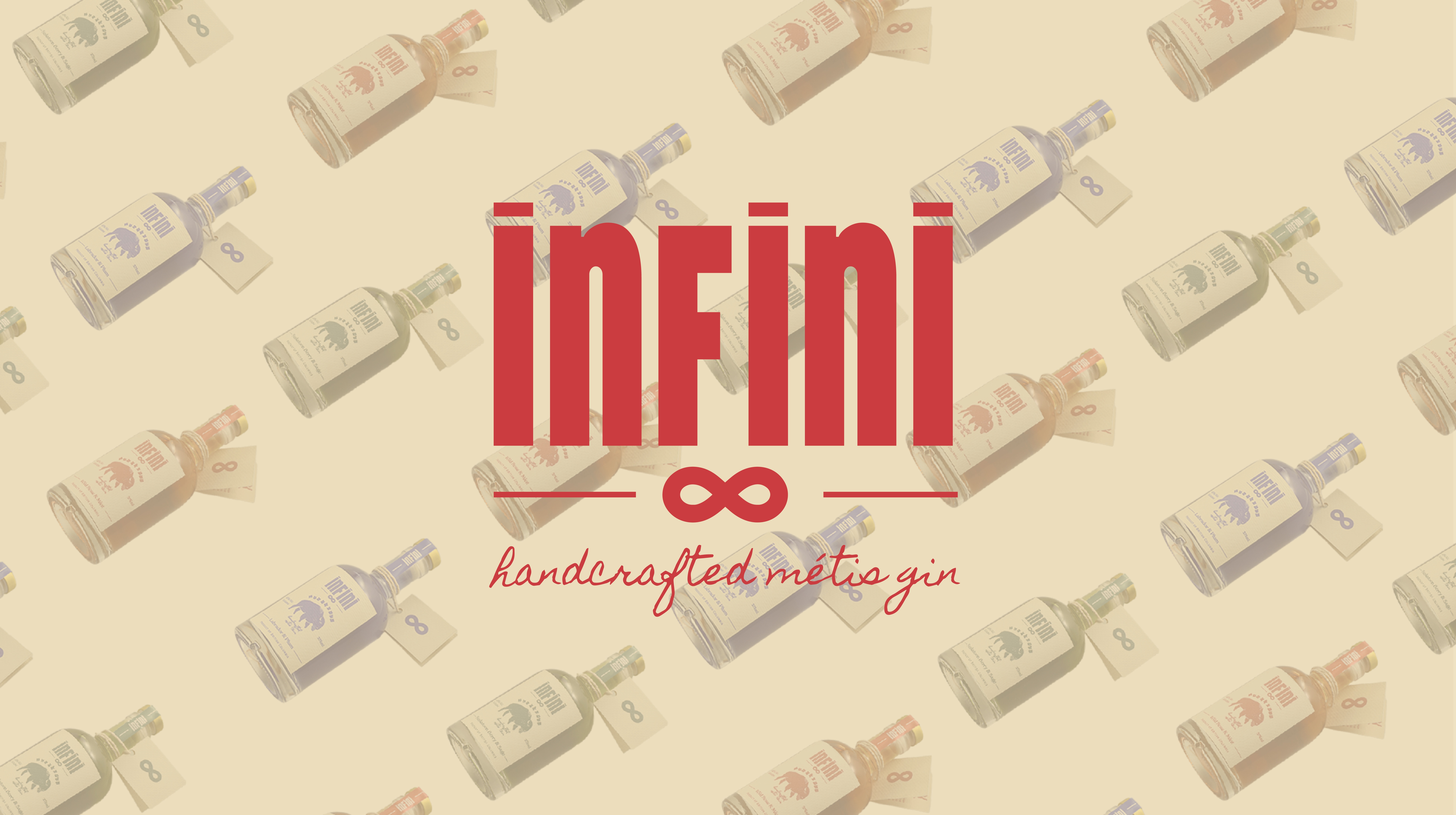
The name Infini comes from the infinity symbol on the Métis flag, representing the unending existence of Métis culture and the blending of two worlds. It's simple, elegant, and layered with meaning—an ideal starting point for a line of spirits that are meant to feel rooted and timeless.
Flavour Direction
- Saskatoon Berry & Sage— fruit-forward with earthy depth
- Wild Rose & Mint — calm, cleansing, grounding
- Labrador & Plum — rich, dark, complex

Design Exploration & Process
The visual identity for Infini Gin was developed through a series of logo sketches, illustration thumbnails, and bottle label mockups. My goal was to create a brand that feels handcrafted, rooted in Métis culture, and visually unified across a potential product line.
I started by experimenting with hand-drawn logotype variations to find a balance between boldness and approachability. Phrases like “Métis owned” and “handcrafted” were tested to reinforce the brand’s authenticity. At the same time, I explored illustration styles that pulled from cultural symbols—like bison, beadwork patterns, and the infinity symbol—to evoke stories of land, legacy, and identity.
These sketches were then brought together through bottle mockups, where I refined type hierarchy, flavour naming, and label placement. I also tested a neck seal tag to give the bottle a crafted, premium feel.

Outcome
This project is a good reminder of how cultural identity can inform strong, authentic design. I’d love to see Infini Gin developed further as a limited series or through a collaboration with Indigenous-owned distilleries. There’s room to expand into packaging, merchandise, and event design centered around Métis storytelling and foodways.


.png)